About the Organization
Broadreach Energy is a finance-led utilities company that designs, funds and manages tailored energy, water and waste solutions across Southern Africa. Its work brings together flexible financing, technical design, infrastructure and ongoing operational support, helping businesses reduce costs, manage risk and meet their sustainability goals.
The problem
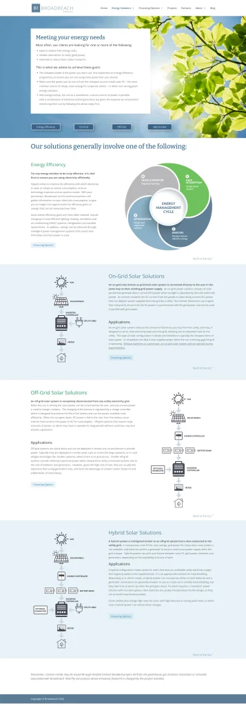
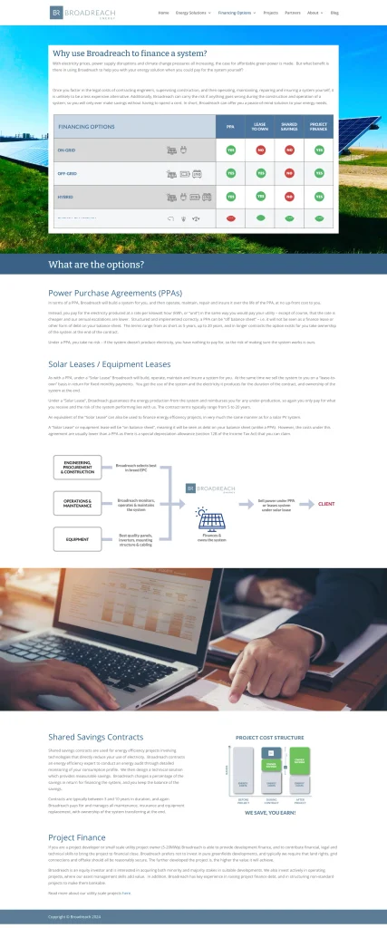
Broadreach offers a range of interconnected technical and financial solutions, each with its own applications, benefits and commercial considerations. The website therefore needed to make a substantial amount of detailed information easy to explore, compare and understand, without oversimplifying the offering.
As the company’s services expanded beyond energy into water and managed utilities, the original website structure no longer adequately represented the full scope of the business. Related information was concentrated on a small number of long, text-heavy pages, making it difficult for visitors to distinguish between the available solutions and determine which might best suit their needs.

The Solution
The content was reorganised into dedicated Energy, Water, Managed Utilities and Finance pages, with each page rewritten and structured according to a consistent visual and informational framework.
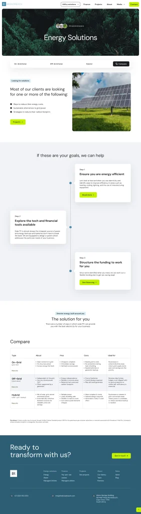
Secondary sticky navigation allows visitors to move directly between the principal sections of each page. Where multiple options need to be evaluated, comparison tables present their key features, benefits, limitations and ideal applications at a glance. Links between the tables and the corresponding page sections help visitors move easily between a concise comparison and more detailed explanations.
Design and collaboration
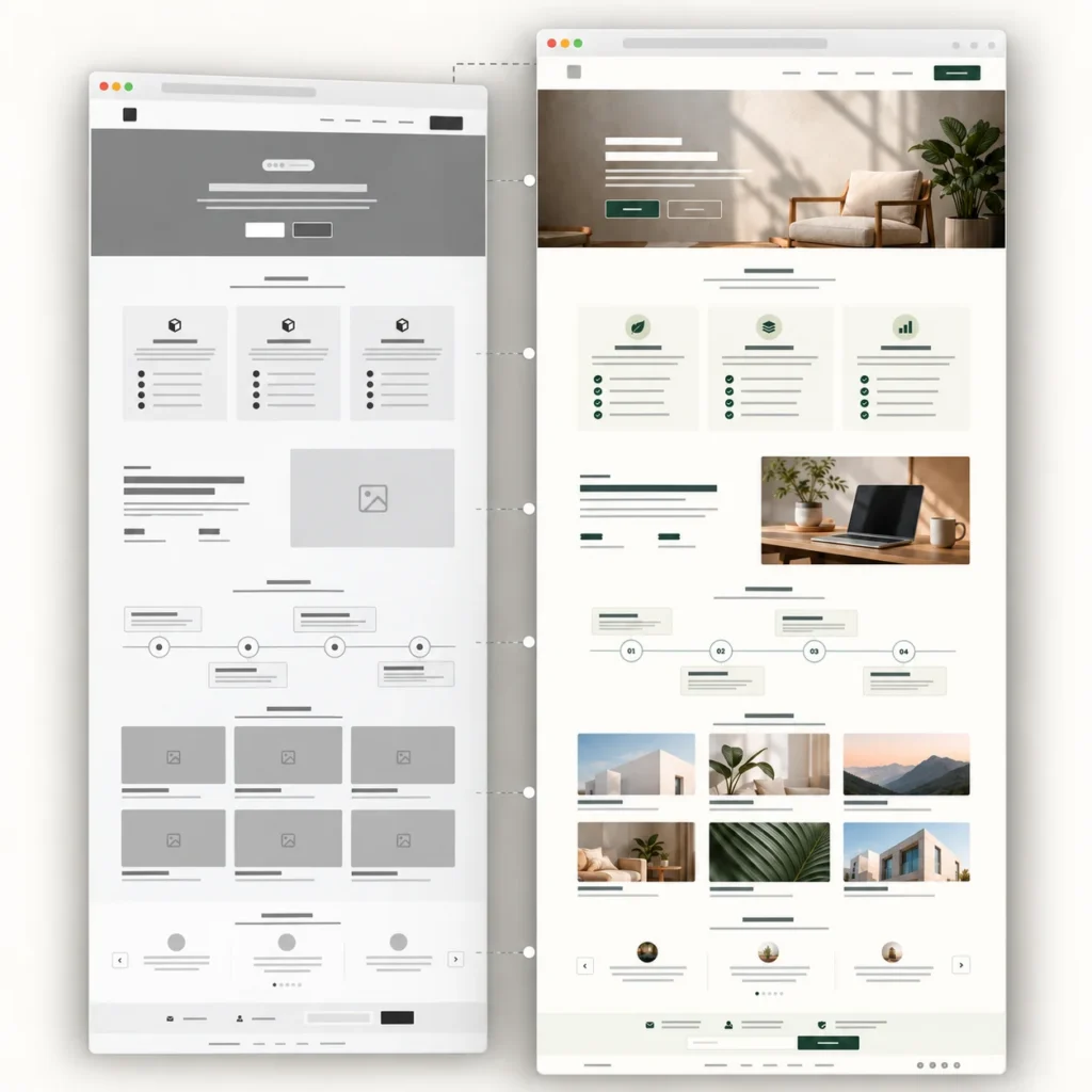
Working with designer Josh Sowter, and marketing strategist Lucy Bekker of Marketing Projects, we began with a detailed content brief setting out Broadreach’s expanded services, proposed page structure, key messaging and available project imagery. The brief and Figma layouts became evolving working documents, allowing the content, design and user experience to develop together rather than treating any one element as fixed from the outset.
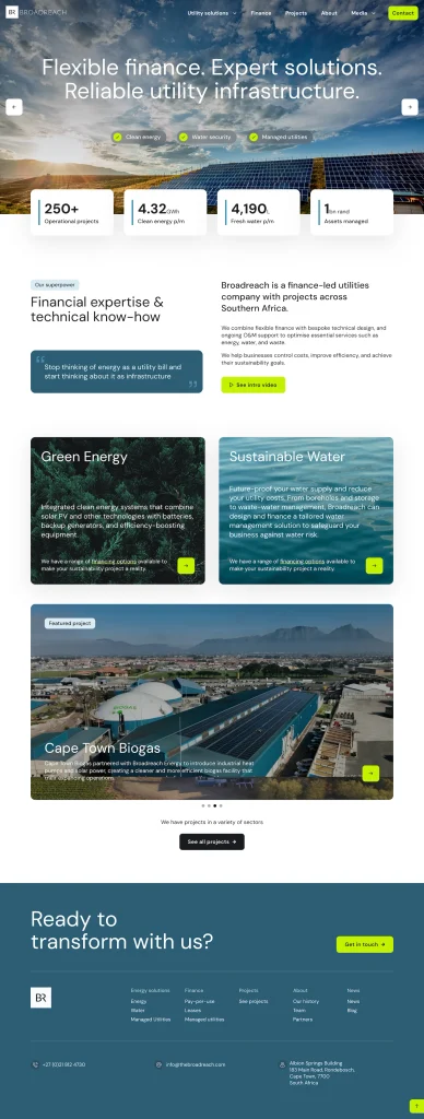
The visual hierarchy was developed around the way potential clients would need to understand the business. Strong introductory statements establish Broadreach’s positioning, while service pages move progressively from the client’s needs to Broadreach’s process, the available solutions and their practical differences. Sticky secondary navigation, clearly defined content sections and comparison tables help visitors move through substantial amounts of technical and financial information without losing their place.
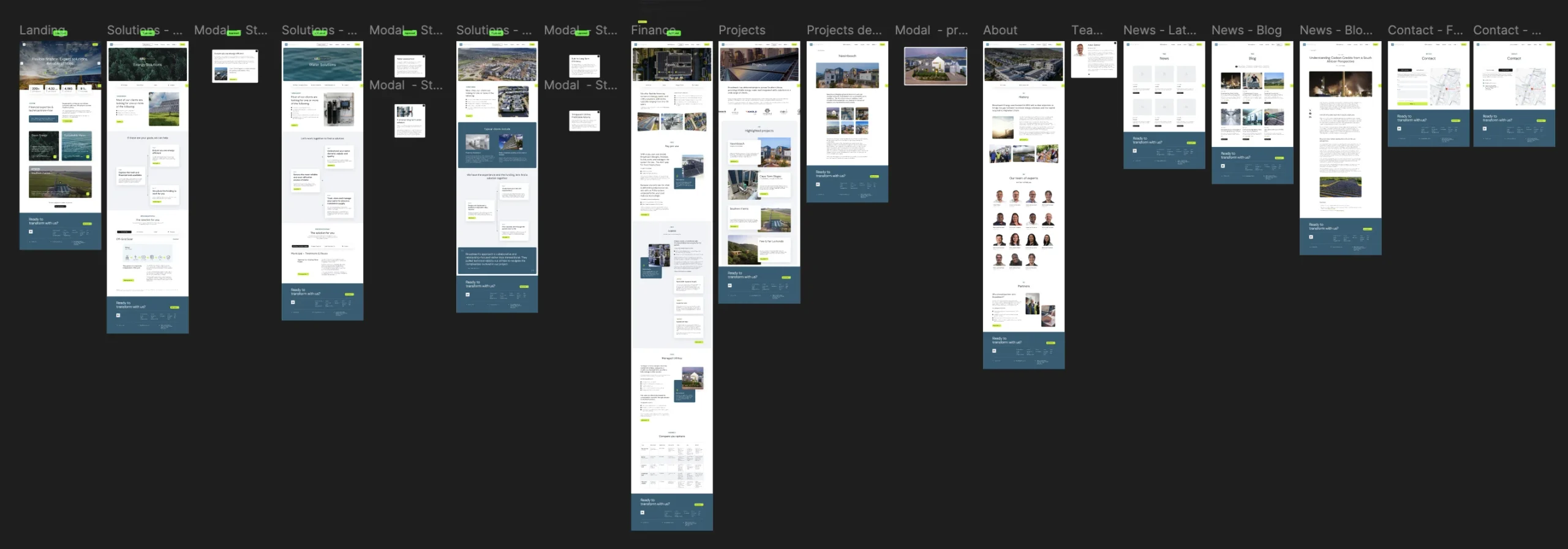
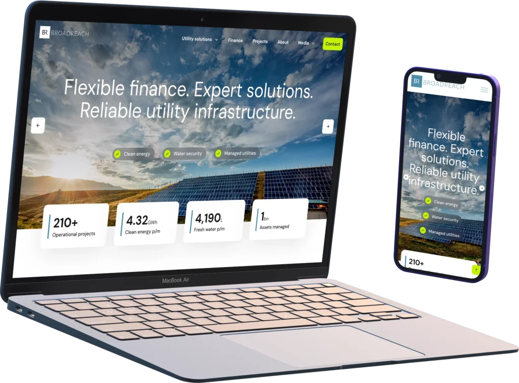
The design also shifts the website towards a more visual, project-led presentation. Rolling hero imagery, video, animated statistics, client testimonials and detailed case studies demonstrate the scale and practical application of Broadreach’s work. Repeated page structures, typography, colours, spacing and interface elements create consistency across the site, while allowing the Energy, Water, Managed Utilities and Finance sections to accommodate different types and quantities of content.
The Figma designs were refined as the content developed, with layouts adjusted to accommodate new services, comparison tables, additional project material and the imagery available from the client. This iterative process allowed the design and content to support one another, resulting in pages that are both visually engaging and straightforward to use.
WordPress development
The website was developed in WordPress using Bricks, with a flexible design system created specifically for Broadreach. Fluid typography and spacing scales allow text, margins and section heights to adjust smoothly across screen sizes, rather than changing abruptly at a small number of fixed breakpoints. Global variables control colours, typography, spacing and other shared values, helping the finished site remain visually consistent and making future changes far easier to implement.
Shared elements such as buttons, forms and navigation components were styled globally, while frequently used content sections were built as reusable components. This reduces unnecessary duplication and ensures that updates can be applied consistently throughout the website. Particular attention was given to how complex desktop layouts rearrange on smaller screens, with sections stacking in a deliberate order that preserves the intended content hierarchy and avoids the cramped appearance common on responsive websites.
Structured content management systems were created for projects and team members using custom post types and fields. This allows Broadreach to add and update content through clearly defined fields while the website automatically handles its presentation. Selected content on static pages was also made directly editable, giving the client practical control without exposing the underlying layouts to accidental changes.
Some of the interface behaviour required bespoke development. The sticky secondary navigation was custom coded to open and navigate to the relevant tabbed content further down the page, helping visitors move quickly between related solutions. The detailed comparison tables were also custom coded to remain readable and usable on mobile devices, where conventional wide tables often perform poorly.
The underlying WordPress installation was kept deliberately lean. The previous website relied on 55 plugins, while the new build uses only six carefully selected plugins alongside Bricks and purpose-built functionality. This reduces unnecessary dependencies and the likelihood of compatibility problems, while making the website easier to maintain, secure and extend over time.
Together, the design system, reusable components and structured content architecture provide Broadreach with more than a faithful implementation of the approved designs. They create a stable foundation that can accommodate new projects, team members, services and content without gradually losing visual consistency or requiring each addition to be designed and built from scratch.
The result
The completed website presents Broadreach as the sophisticated finance and utilities partner it has become, rather than simply a provider of solar installations. Its expanded energy, water, managed utility and financing services are now clearly separated while remaining visibly connected as part of one integrated offering.
Visitors can understand Broadreach’s capabilities, compare their options and explore relevant projects without having to work through long, unstructured pages. The stronger visual presentation also brings the company’s scale, technical expertise and track record to the foreground.
Behind the interface, Broadreach now has a leaner and more manageable WordPress website built around reusable components and structured content. The result is a consistent, responsive platform that is easier to maintain and ready to accommodate new projects, services and content as the business continues to grow.
Visit Broadreach Energy to see the completed project.