This quick guide aims to demystify the essential website parts that make up a web page. Whether you’re new to web design or just curious, this guide will provide you with a clear understanding of the key elements involved.
Website Structure
The structure of a website serves as its foundational framework, typically consisting of a header, a main content area, and a footer.

Certain design guidelines apply to these elements, starting with their width. Read more about widths in our website mockup size guide.
Header
The header is the topmost part of a website, and one of the most essential parts of a website. It usually appears on all pages and posts, and it servers two main purposes: identity and navigation. As such the header usually contains a logo and a navigation menu.
Logo
A logo quickly identifies the website. As such it is usually placed in the header in the top left corner where it is the first thing seen as your eye scans the page.
A logo represents your brand, and as such it should be recognisable and memorable. In fact the logo is often the starting point of the entire website design. The colours of the logo often dictate the colours used in the web design, and the style of the logo can strongly influence several design choices.
Read more about our design services, which include logo and brand identity design.
Menus and Navigation
In website design the terms “menus” and “navigation” are sometimes uses interchangeably, a menu being a type of navigation. However “navigation” is more often used to refer to the navigation area, for example “header navigation” or “footer navigation”, whereas “menu” is more often used to describe a specific set of links, for example a set containing Home, About, Contact.
You can have navigation elements in more than one place on your website. They can be below the header, above the header, inside the header, or somewhere else.
Primary and Secondary Navigation
The terms primary and secondary navigation refers more to their functionality than their position. Either may be positioned above or below the header. Primary navigation would usually link to your main static pages.
Secondary navigation, on the other hand, would usually be lower-priority. It is usually for pages relating to some technical functionality of the site. An example usage would be for a user’s account profile.
Sub Menus and Dropdown Menus
Some items in your menu may have additional related items in the hierarchy represented in a sub menu or dropdown menu below the parent item.

Content Area
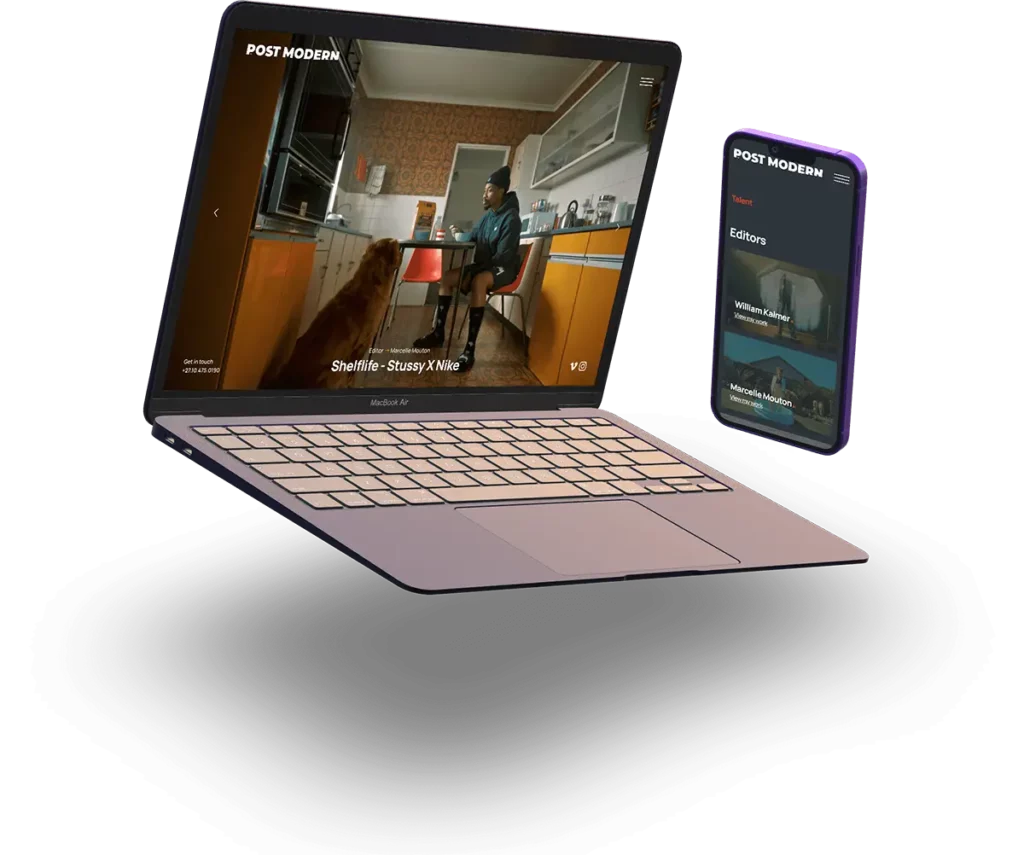
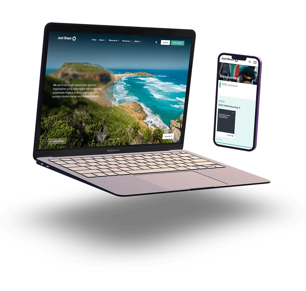
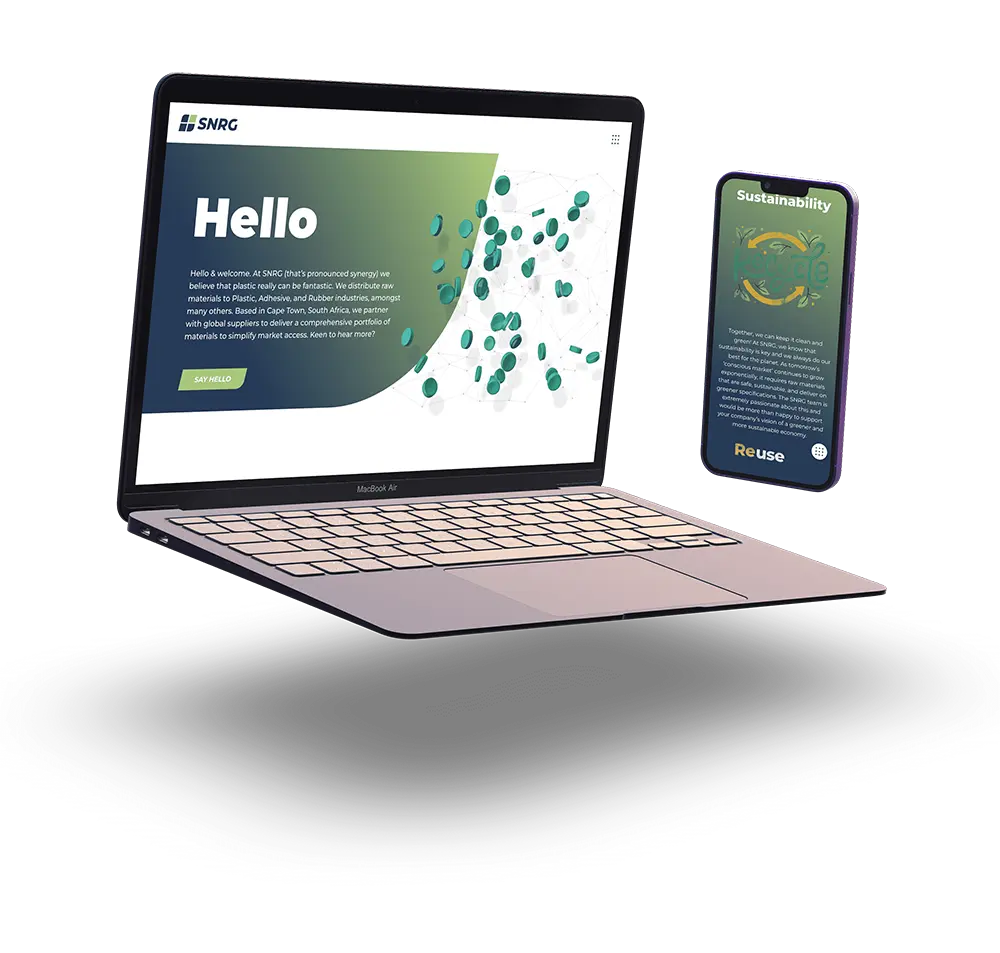
The content is the text, images, video, audio, anything added to the website within the framework. The content is typically displayed in the inner section. This is why it is sometimes referred to as the content area.
The content may consist of static text which provides information about you or your company. Or it may consist of occasional updates in the form of a news feed or blog, usually known as posts.
Using WordPress, content is easily managed by you in a convenient interface similar to a word processor.

Footer
The footer is located at the bottom of a website, usually on every page or post, and often contains links to important pages, contact information, and sometimes social media icons.
More?
See our glossary of website design terminology here.