
Related:
Web page layout – with CSS flexbox and Bricks
Responsive Sizing System using CSS Clamp
This website mockup size guide is aimed primarily at designers building mockups and prototypes, and developers creating websites and laying out web pages. For a more hands-on practical tutorial, see our article Web page layout – with CSS flexbox and Bricks.
Most modern websites are wider than their predecessors, and often have background elements which stretch to the full width of the device. This begs the question: when designing mockups and prototypes, what width should I use for my design?
For desktop mockup designs, designing at a width slightly larger than the outer width of your website’s elements will usually suffice. Mockups built at 1920px, 1440px, and 1280px are not uncommon.
Let’s take a quick dive into what these widths are. Within the full width of the browser window there are two main container widths to consider when designing for large devices.
For a quick guide to the various parts that make up a web page, take a look at our Website Parts article.
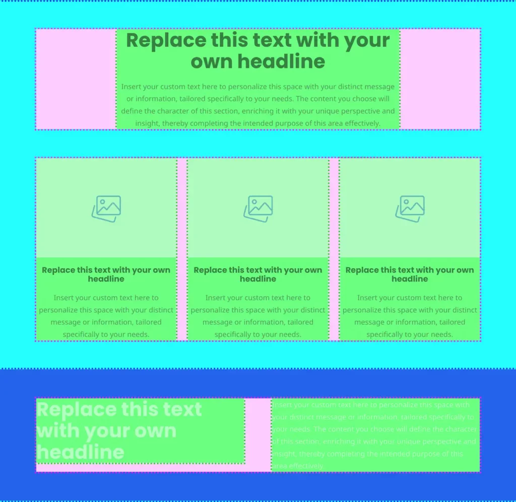
Definitions: The Two Widths
Outer Width Definition
Within the full width of the screen is the website container, an invisible box which constrains the outer elements such as elements in the header, footer, and some content elements, for example home page columns.
Content Width Definition
Inside that, the content wrapper is a narrower container which holds some of the page’s content elements, such as text and images. A narrower content width makes for easier reading when text is in one column.

Width Considerations
Various factors – such as whether a website uses large font sizes – may influence the widths of the outer and content containers.
Outer Width Considerations
The choice of outer container size comes down to how widely spaced you think the outer elements – usually elements in the header, such as the logo and navigation – should be on a large screen.
Mockups should be provided which are slightly wider than the outer container to show what happens on wide screens. A container of 1366px would require a mockup of around 1440px wide for example.
If the outer container was 1200px wide then a mockup of 1280px wide would suffice for both desktop and laptop sizes.

Content Width Considerations
The width of the content container also comes down to the specific requirements of the website, in this case the requirements of the content.
What is the best width to be able to comfortably read the body copy at the font size it will be on the final site?
Does the website use columns, or a grid system? If so, decide how many blocks or columns there should be, and how wide they should be.
Who are your target audience? Do they own devices with very large screens? Are you showing them very wide photos?
Design questions such as these should serve to determine the content width.
Which Device Sizes to Mock Up?
Once the widths have been chosen, and a design mockup has been done for wide devices, then the next device-size down the list should be considered.
The decision whether to provide a mockup in one of these smaller sizes comes down to whether there are significant changes to the design at that size to warrant mocking it up.
Device sizes
Desktop
Larger than 1280px
Tablet / iPad Landscape
1024px
Tablet / iPad Portrait
768px
Smartphone Portrait
320px
(768px usually covers smartphone landscape, so depending, there’s probably no need for a mockup of smartphone landscape.)
For Example
This 1280px laptop width is smaller than the outer website width, so padded header elements sit close to the edge of the screen. However the smaller size does not significantly impact the design, so a mockup would not necessarily be required for this specific device size.

In this case a desktop, iPad, and iPhone mockup would suffice: build at 1920px, 1024px and 768px.
Conclusion
When building website mockups there is no single width rule, except possibly for mobile devices where you can usually get away with 1024x and 768px wide.
For your larger devices: laptops and desktop screens, it depends on what the maximum width of your outer elements are. In theory you could simply build at a massive 2560px to cover all large devices, but this would prove unwieldy for developers to work from. So it’s best to match your laptop and desktop mockup sizes closely to the outer width of the website elements in your design.
Read more about our website design services.
Related:
Web page layout – with CSS flexbox and Bricks
Responsive Sizing System using CSS Clamp


