
Blog
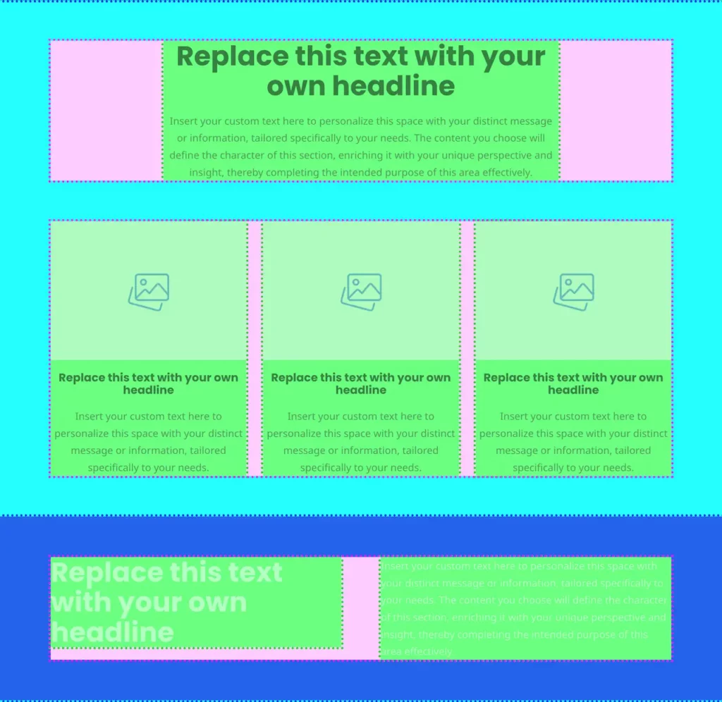
Web page layout – with CSS flexbox and Bricks
Related:Bricks vs Elementor - why we switchedWebsite Mockup Size GuideResponsive Sizing System using CSS Clamp Introduction This article aims to
Read more
Responsive Fluid Sizing System using CSS Clamp
Related:Bricks vs Elementor - why we switchedWeb page layout - with CSS flexbox and BricksWebsite Mockup Size Guide Overview When
Read more
Website Mockup Size Guide. All about viewport width and content width.
This website mockup size guide is aimed primarily at designers building mockups and prototypes for developers.
Read more
What is WordPress?
In this article we'll answer the question in the title "what is WordPress?", as well as exploring WordPress in some
Read moreLog into WordPress – How to log into your WordPress admin dashboard
Introduction You have a brand new WordPress website and now you would like to start creating or editing your content.
Read moreWeb Development and WordPress FAQs
Web development is the activity of working with web browser technologies, such as writing code in the browser-side languages of
Read more
Design FAQs: Frequently Asked Questions about Design
A design is a visual plan for building an object, a system or even a process. The word design can
Read more
App FAQs: Frequently Asked Questions about Apps
What is an app? In general, an app – short for “application” – is simply a computer program. However the
Read more
Working with a web developer: the web design and development process
These guidelines aim to make your website project a smooth and pain-free process by outlining the process of working with
Read more